
Illustration by Clark MillsCar and Driver
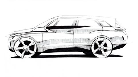
What should the cars of the future look like? How smooth, how tall, how spacious should they be? For more than a century, most automotive designers have had to work around an internal-combustion engine and transmission. Gas, diesel, and hybrid powertrains need room to spin and breathe—sometimes to the detriment of passengers. We're so used to stumbling over the hump of a driveshaft tunnel and giving up kneeroom for the sake of a set-back engine that it never occurred to most of us that anything could be different. But in the future, especially the near future, with a focus on electric cars built on new, dedicated platforms, designers have a rare opportunity to reimagine what a car can offer.
Many early EV ventures used existing platforms and arranged electric powertrains to fit where gas engines and transmissions had previously resided. Even Tesla's first attempt was a revamped Lotus Elise without its 1.8-liter inline-four. Working on a nondedicated, or "nonnative," electric platform limited designers' options for positioning the battery and motor. Automakers often stacked batteries under the rear seat—which is why early EVs sometimes offered less legroom or cargo space than their gas counterparts—and put the motor assemblies under the hood. Even the Nissan Leaf, which packages an underfloor battery in a dedicated EV platform, still follows the old philosophy of carrying a motor where an engine normally goes. Aesthetically, too, the early electrics couldn't break away from distinct grille shells and large air vents.
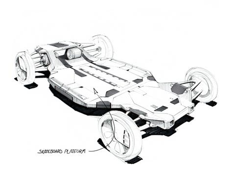
In 2017, the consulting firm McKinsey & Company said long-term use of nonnative platforms for electric-vehicle design was inefficient. Most automakers seem to agree. This year we've seen a wave of new models on dedicated EV platforms similar to the flat-battery, motors-at-the-axles "skateboard" layout Tesla has been using since the Model S launched in 2012. Rearrange the words "global," "modular," and "electric" and pick your platform from a variety of scalable roller skates with acronyms like EVA and E-GMP to see how designers reshape the automobile when they aren't working around an engine.
What's Inside Counts
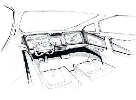
"We have the opportunity to give the car a totally new kind of proportion," says Steffen Köhl, Mercedes-Benz director of advanced exterior design. Köhl worked on the EQS, the first car on Mercedes's new Electric Vehicle Architecture (EVA). The EQS is a luxury sedan with a long wheelbase, a sweeping bridge of a roofline, and a large, screen-filled cabin. Think of it as the S-class of EVs. The underpinnings of an EV allow for bigger interiors in smaller vehicles, he says. It can be "cabin-forward, with short overhangs in front and rear. Since the battery is flat ground, we can try a new kind of interior—smooth panels, the center console floating. There are no more ups and downs between the seats."
Escaping the tyranny of the center tunnel is exciting to many designers. Imagine trying to decorate a room with an undulating hardwood floor. Furniture would be pushed to the side, with the center of the space unusable. In cars, designers regularly hide the hump with a shallow console in the front; in the back, they simply cover it with carpet and ignore it. But now that they can smooth out that hump, there's a lot more room to play with. Köhl's team on the EQS used this newly available real estate for an elegant multilevel console with room for a large bag in a pass-through by the driver's knee. In Hyundai's new Ioniq 5, which rides on the Electric Global Modular Platform (E-GMP), the space is left open, giving driver and passenger the opportunity to bump knees romantically at stoplights, although that's not in the press literature. The flat floor also allowed Hyundai designers to put in a deep console that slides rearward so front-seat occupants can enter or exit from either side of the car.
The Great Outdoors
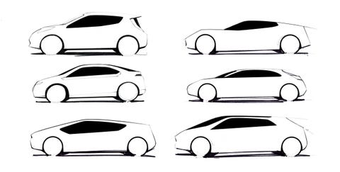
Early discussion of EV design was a chorus of moans from car enthusiasts about how designers would become slaves to the wind tunnel, pursuing a coefficient of drag that made everything look like an owl pellet on wheels. This dire prediction has not come to pass. Aerodynamicists have been able to work with shapes that range from the tennis-shoe profile of the Volkswagen ID.4 to the shocking angles of the Tesla Cybertruck to the sports-car smirk of Porsche's Taycan. According to Köhl, the smooth blob that caused the great panic was never a technical requirement; it was more of a marketing choice.
The first modern electric cars "were very much trying to show the world, 'Hey, I'm different. I'm a new thing,'" he says. "You don't need a wheel cover to prove that you're a great electric design. With the EQS, we have a coefficient of drag of 0.20. Perfect drag, no silly disc wheels with no shape. You can create electric design without being so obviously different or ugly."
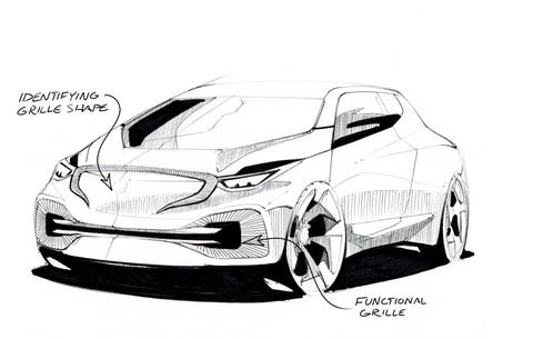
EV designs from the early 2010s didn't seem to know what to do with the front of a car. Electric motors still need cooling. But with different demands, that cooling doesn't have to come through a large center grille the way it commonly does for an engine. Do you leave the grille because it's already there? Eliminate it, leaving only the smooth profile of what was? Tesla has chosen that road, a decision that once led me to describe the Model 3 as "a Mustang in a bondage mask," thus earning me many angry messages from Tesla fans and a few friendly ones from bondage fans. We are used to a face on a car, though, which is why the grilleless Tesla fascia was so striking. Newer designs are getting playful with the space. Certain Ford Mustang Mach-E models wear a mustache. Köhl's EQS gets appropriately Mercedes fancy, with a glossy field of embedded stars on some trims. The grille has been a brand billboard since Henry Ford first stamped his name on the Model T radiator shell, and while gas-powered cars are being forced to devote more real estate to cooling, EVs can use the space for purely aesthetic choices.
Front Loaded
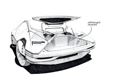
With empty spaces under the hood and behind the rear seat, EVs can offer a massive amount of cargo storage. "Put it in the trunk" leads to the follow-up question, "Which one, back or front?" A front trunk is not a recent invention, but marketing it as a frunk and touting its convenience seem to have started somewhere between Porsche Boxster and Model S.
If Tesla gets credit for mainstreaming the frunk, Ford is taking it to the next level with the F-150 Lightning. The electric version of America's most popular vehicle doesn't play into a lot of the EV design trends we've been talking about. It's not an EV-only body; it uses the same cab and bed as the gas F-150. Exterior designer Kenny Moore says Ford's research indicated that truck buyers wanted a pickup with "a more modern look" than today's internal-combustion models, "but not so futuristic as to be unrecognizable as a truck." That meant a few lighting changes and a couple of aerodynamic tweaks, but not so many that the Lightning doesn't read as an F-150 first and foremost. It's just an F-150 with that holy grail of truck options: lockable, weatherproof storage that doesn't take up cab or bed space.
"It's revolutionary, right? This is a space [truck owners] never had before," says Nancy Reppenhagen, who led the development of the Lightning's front trunk. Reppenhagen and her team looked at other EV cargo areas and adapted what they found to meet a truck buyer's expectations. "We saw a lot of carpeting and soft trim, which obviously weren't ideal for a truck. We chose function, which I also think is beautiful." As more electric vehicles enter the market, their different design parameters may make us all redefine what makes a car beautiful.
This content is created and maintained by a third party, and imported onto this page to help users provide their email addresses. You may be able to find more information about this and similar content at piano.io
"electric" - Google News
July 07, 2021 at 07:00PM
https://ift.tt/3yxjS2k
Why Do Electric Cars Look The Way They Do? Because They Can - Car and Driver
"electric" - Google News
https://ift.tt/2yk35WT
https://ift.tt/2YsSbsy
Bagikan Berita Ini



0 Response to "Why Do Electric Cars Look The Way They Do? Because They Can - Car and Driver"
Post a Comment