-
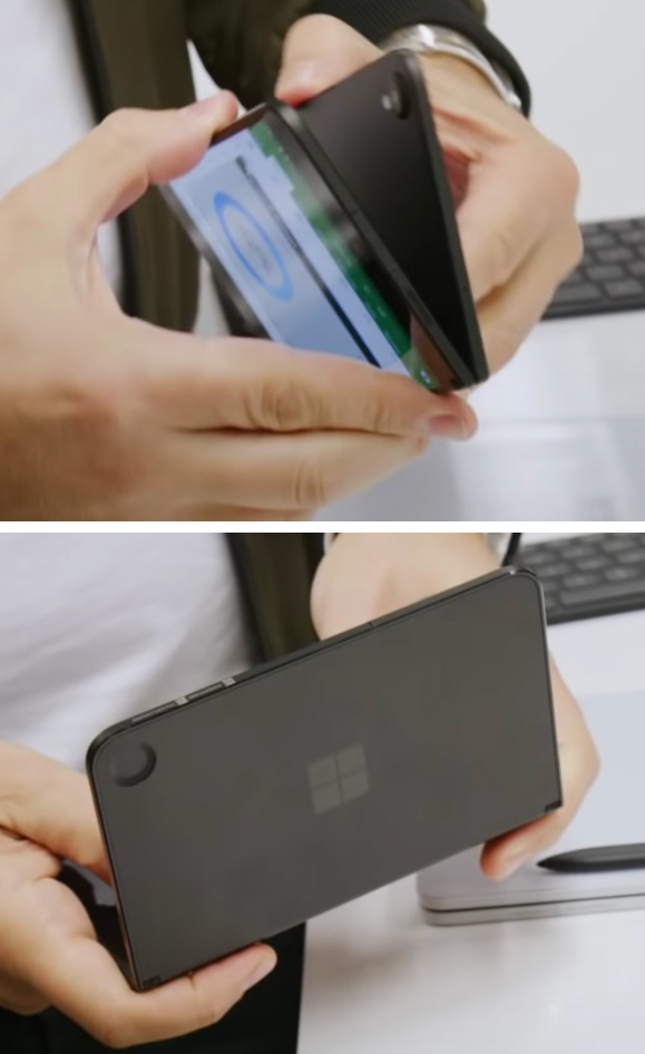
The Microsoft Surface Duo. It's very big.Ron Amadeo
-
There's something very satisfying about flattening it down on a table.Ron Amadeo
-
The hinge will stop anywhere you want it to stop.Ron Amadeo
-
Fold it all the way over for single-screen mode.Ron Amadeo
-
If you're looking at the wrong side in single screen mode, just double-tap the screen.Ron Amadeo
-
All folded up. And that's a Microsoft logo on the front, not a Windows logo.Ron Amadeo
-
The top has big bezels, an earpiece, and a single camera and LED flash. This is the only camera on the entire phone.Ron Amadeo
-
The back.Ron Amadeo
-
The spine is very shiny.Ron Amadeo
-
The bottom USB-C port, featuring some alarmingly thin plastic around the port.Ron Amadeo
After one of the strangest run-ups to launch in smartphone history, the Microsoft Surface Duo is here. Microsoft's first-ever Android phone (sorry, we're not counting the Nokia X) was announced and demoed an entire year before its release, hinting at what a long and winding road the Surface Duo took from inception to shipping. The hardware apparently dates back to plans to revitalize Windows for phones, but after that plan fell through, the hardware was upcycled into the most head-scratching Android phone of the year.
The Surface Duo sales pitch is that foldable display technology isn't ready yet, so try this best-we-can-do-right-now version that features two rigid, 5.6-inch OLED displays attached together with a 360 hinge. Microsoft is calling this a "productivity" device thanks to it having the side-by-side app capability of a tablet-style foldable smartphone without any of the janky display technology. Microsoft's website also says the Duo was designed to "inspire people to rethink how they want to use the device in their pocket," indicating that the company definitely sees this as a primary device.
I bring up Microsoft's sales pitch because, boy, is the Surface Duo bad at doing the things Microsoft says it's supposed to be good at. The phone feels like it was made without any respect to ergonomics, hand size, pocket-size, or anything that makes a good Android phone. It has crippling productivity problems that negate any benefit you could get from the two-screen design, it's extremely awkward in day-to-day use, and it's very buggy. The phone is missing a whole host of features you would expect for the stratospheric $1400 asking price, and even the hardware that is here seems like it's a least a year old.
The Surface Duo feels like a phone that was slapped together without a plan, and the reports of the phone's history indicate that's what actually happened. We would like to gently welcome Microsoft to the Android ecosystem, but we are not grading $1400 smartphones on a curve. Microsoft needed to knock this out of the park. Instead, the company turned in a borderline incompetent smartphone that I really had to force myself to use during the review period.
Table of Contents
- At least it's very pretty
- Way too wide
- Andromedia: Why the Surface Duo is such a weird Android device
- The Software: Windows Incorporated makes an Android build
- The quirky dual-screen implementation
- Notifications are really bad
- Uh, how are you supposed to type on this thing?
- Microsoft's ecosystem
- The Bugs! There are so many bugs.
- A smartphone that is very bad at smartphone things
- The Good
- The Bad
- The Ugly
At least it's very pretty
The main thing the Surface Duo has going for it is that it is very pretty. It's a minimalist glass sandwich with a sophisticated pearl white and chrome color scheme that is just a pleasure to look at. The phone is absolutely cracker-thin, and along with the Moto Razr, it's one of the rare foldable smartphones that doesn't look like an ugly brick. If you've got two free hands, there's something very comfy about holding the Duo in book mode and just casually flipping through something. The shock and awe of Microsoft's design language is probably enough to make some people fall in love with the device and ignore all its other faults. I mean, not me, of course, but some people.
| SPECS AT A GLANCE: Microsoft Surface Duo | |
|---|---|
| SCREEN | Two 1800×1350 5.6" OLED displays (401ppi, 4:3 aspect ratio) |
| OS | Android 10 |
| CPU | Eight-core Qualcomm Snapdragon 855 Four Cortex A76-based cores (One 2.84GHz, three 2.41Ghz) and four Cortex A55-based cores at 1.78GHz |
| RAM | 6GB |
| GPU | Adreno 540 |
| STORAGE | 128GB or 256GB |
| NETWORKING | 802.11b/g/n/ac, Bluetooth 4.2, GPS, |
| PORTS | USB 3.1 Gen1 Type-C |
| CAMERA | 11MP |
| SIZE | Open: 145.2mm x 186.9mm x 4.8mm Closed: 145.2mm x 93.3mm x 9.9mm |
| WEIGHT | 250g |
| BATTERY | 3577 mAh |
| STARTING PRICE | $1400 at Microsoft |
| OTHER PERKS | Side fingerprint sensor |
The word that most comes to mind when describing the Surface Duo is "flat." The body of the phone is not perfectly flat, but it's uninterrupted sheets of glass on the front and back of both halves. There's no camera bump, no curved sides, just four sheets of glass. When closed up, the outside of the phone also gives off a minimalist look with no lights, cameras, or wordmarks, just a single, reflective Windows logo Microsoft logo. The Surface Duo almost doesn't look like it's an electronic device. You could easily make a Moleskine notebook that looks just like a Surface Duo. In fact, I'd bet a Moleskine is where a Microsoft got the dimensions for the Surface Duo. The "Pocket" version of the little notebook is 140mm x 90mm, while a Surface Duo is 145.2mm × 93.3mm when closed.
Crack open the Duo and you'll find a series of strange decisions. First there's the two 60Hz 5.6-inch displays with a 4:3 aspect ratio, so they are way wider and way shorter than most other Android displays. Next you'll find some comically huge bezels on the top and bottom of the phone, which really ruins the "digital Moleskine" vibe the device gives off from the outside. It's not really clear why the bezels are so large. We certainly have the technology to make them much, much thinner, and as we'll get into later, the short, fat 4:3 displays would greatly benefit from the extra height. I'll guess that this is one of the Surface Duo's many concessions to thinness.
Pretty much all the phone bits on the right half of the device. On the bottom edge of the right half, you'll see the USB-C port, on the right edge there's the sim tray, a volume rocker, power button, and an ultra-skinny side-mounted fingerprint reader. The right half handles phone call duty, with an earpiece in the top bezel and a microphone slot on the bottom. The internals mirror this layout, too: all the phone chips are in the right half of the phone, while the left half is almost all battery. The only thing on the left side besides another screen is the phone's only media speaker, which exits via a slot in the top of the display glass. With a mono speaker, no headphone jack, and a wonky 4:3 display, the Surface Duo is not exactly a media machine.
You'll find the only camera hardware in the right side's top bezel: an LED flash sits next to a terrible 12MP sensor with a very cheap looking pinhole lens. The 360 hinge allows this to double as both the selfie camera and the main camera, which is clever. But in a device as thin as the Surface Duo, the camera never had a shot at being good. Most phones need additional thickness to squeeze in a quality camera sensor (the camera bump), and today most smartphone camera sensors are thicker than the entire 4.8mm body of the Surface Duo.
There is not a market for camera sensors that fit into this thin of a profile, so Microsoft probably really had to dig through the industry parts bin and settle for anything that would fit. We know Microsoft kicked around a few ideas to try to fix this. One early Surface Duo prototype has a camera bump on the rear of one half of the device, with a divot on the other half so the phone can still fold flat. The company also has a patent for a camera lens that would fit into a thin profile and then grow taller when it was in use, like an old-school point-and-shoot. In the end, we got no camera bumps and no fancy camera tech, just a thin, smooth device and a compromised camera.
The Surface Duo hinge feels exactly like a laptop hinge. It's stiff enough to stay wherever you put it but still easy to move around. Like a laptop hinge, there is continuous resistance throughout the entire movement with really no assist at all, so you won't be flipping the phone open or closed, and you'll always need two hands to open the phone. The hinge folds all the way around, so you can turn your dual-screen phone into a single screen by folding one display all the way back. It's easy to switch sides in this mode, too—just double tap on the display you want to light up. You can do whatever you want with the hinge: hold the phone like a book, flatten the phone out against a table, prop it up like a tent, or turn it into a mini laptop.
One amazing thing about the hinge mechanism is that there's no padding of any kind for when you close it, yet the closing process still feels safe, soft, and gentile. The Galaxy Fold and Moto Razr have either rubber feet or a big plastic bezel to protect the screen from being slammed closed. On the Surface Duo, there are no bumpers at all, so closing it means you are pressing one slab of glass against another. You might expect to hear a shattering noise after an enthusiastic close, but it feels like the hinge is doing some cushioning work, and you never feel like you have to be gentile closing the phone.
Microsoft went all out to make the Surface Duo as thin as humanly possible. If you measure the Surface Duo when it's open, it qualifies as one of the thinnest smartphones of all time at just 4.8mm thick. You'd have to go back to the thinness craze of the mid-2010s to find anything as paper-thin as the Surface Duo—the 4.75mm thick Vivo X5Max, which I think still holds the title of "world's thinnest smartphone." (It even had a headphone jack!) The Surface Duo might be the world's second thinnest smartphone, or maybe even #1, since it doesn't have a camera bump like the Vivo X5Max.
The internals of this phone are really incredible and show Microsoft pulled out all the stops to get as thin as possible. In a normal, modern smartphone, the goal is to reduce the motherboard area for a bigger battery, and manufacturers have started constructing motherboards like a multi-story house. Not only does a single board have chips on the top and bottom side, manufacturers have started stacking up multiple layers of circuit board. Something like an iPhone 11 has three planes of chips. The bottom has a single-sided board that can be pressed against the back of the case, then a double-sided board is stacked on top of that. The Surface Duo is the complete opposite: It has a massively large motherboard that is actually single sided. Every single chip is on one side of the board, and the backside is flat, reducing the height as much as possible.
-
The internals of the Surface Duo. There's a battery in each half, and a massive motherboard surface area.
-
The motherboard is so huge because every single chip is on this side. Now check out the next slide.
-
The back side of the motherboard is totally blank! No other smartphone is designed like this.
-
To get an idea of how different the Duo is, here are the components of an iPhone 11 Pro Max, and you'll see only the tiniest scraps of motherboard in the middle of the image. And that's not all—these two pieces actually get stacked on top of each other.
-
Here's the iPhone 11 Pro chip sandwich as it sits in the assembled phone. You can see the sandwich (top) gets opened up in the bottom image, showing three planes of chips.
While the push for thinness in the mid-2010s was a pointless gimmick, for foldables, thinness is a major factor for portability. This thing has to go in your pocket, after all. Folding in half means it grows to double the thickness. However, Microsoft's obsession with thinness means the phone is still only a svelte 9.9 mm when it's folded up, which is still only on the high-end of normal smartphone thickness. Staying in the realm of smartphone thickness is a nice improvement over the brick-like form factor of some other foldables. The Galaxy Z Fold 2, which made no concessions for thinness, is 16.8mm when it's folded up—that's basically two normal smartphones stacked on top of each other.
Microsoft did not quite think out how the thinness of the device would clash with its material choices, though. The sides of the device are plastic, and while it looks and feels fine, thin plastic isn't very strong. Everything is fine until you get to the USB-C port, which, since the port is almost as thick as the entire phone, has only the tiniest sliver of plastic surrounding it. It's alarming how much you can move the plastic just by pushing it with your finger. There are already reports of the plastic around the USB-C port cracking and breaking off, and I have no doubt I could snap it with my finger. Half a millimeter of plastic (I measured) isn't sturdy enough for anything, let alone a high-stress point like the USB-C port. Did I mention yet that there's no wireless charging?
One odd thing about the Surface Duo is that it kind of feels like you could pick it apart with your fingernail. The plastic sides don't wrap around the inner or outer glass at all, leaving the sides of the glass panels exposed. There's actually a gap between both panes of glass and the plastic edges, and you can easily stick a piece of paper in there, or even a fingernail. It's an odd way to make a phone, where normally the glass would be recessed into whatever material the sides were made out of, and any gaps would be impenetrable. If Microsoft had wrapped the plastic edges up around the glass, like normal, the area around the easily-broken USB-C port would be about twice as thick, while the overall phone wouldn't have been any thicker, which seems like a good idea! Obviously, after this description, the phone is in no way water-resistant.
In addition to missing wireless charging and water resistance, the Surface Duo also doesn't have NFC, which is a big omission for a $1400 device. There's also only a 60Hz display, when most other phones in this price range will offer 90 or 120Hz displays, offering a much smoother interface.
Way too wide
All of Microsoft's work on thinness was presumably to avoid the brick-like feeling of other foldables, but it feels like it was all in vain. The push for thinness just made the Surface Duo ridiculously large in a different dimension: the width, which is an incredible 93.3mm when folded up. Now our "thinnest smartphone ever" is also the widest smartphone ever. Smartphone screen sizes might get ever-bigger, but this is a diagonal measurement, and the dimension phones have primarily been growing in is the height. Manufacturers have kept a lid on smartphone width, because when a phone gets too wide it becomes unpleasant to use. The last high-profile super-wide Android phone was probably the Nexus 6, and at 83mm wide, it was widely ridiculed for being a pocket-busting monster. Manufacturers have mostly stayed away from anything that wide since.
Even when folded up, the 93.3mm wide Surface Duo is far outside the realm of normal, and it turns out phones are not normally this wide for a reason. The Surface Duo might fit in your pocket, but if it does, you'll probably walk funny. It is very uncomfortable to haul this thing around in a pocket, where the wide, flat body will stick out way beyond the shape of most people's leg. It's such a pain to carry around that I frequently just wanted to leave the Surface Duo at home and bring something else during the review period. And I'll say again, this is supposed to be a primary phone that you carry with you. Microsoft's own website says it "designed Surface Duo for people who want to get more done with the device in their pocket." It apparently did not consider "mobility" when it was drawing up this phone.
If and when you do pry the Surface Duo out of your pocket, I hope you have both hands free because the width makes it more awkward to hold one-handed than other phones. It's an uncomfortable stretch if you're just holding it to poke at the screen with your other hand, and you can forget about trying to hold the phone and quickly type something on it with your thumb on the same hand. It's just way too wide. The Surface Duo is just generally bad at quick, casual interaction.
-
How big is too big? A Surface Duo is over 1.5 times the width of the 2020 iPhone SE.Ron Amadeo
-
And here it is next to one of the biggest phones ever, the Nexus 6. The Nexus 6 was widely considered too wide, and the Surface Duo is wider.Ron Amadeo
-
The Surface Duo's short, fat display doesn't leave a lot of space for app content. Here it shows five apps on this list, while the more portable Pixel 4 XL shows eight apps.Ron Amadeo
-
A web page on the Surface Duo compared to the Pixel 4 XL. The wider screen is at its best here, but it's still not very good.Ron Amadeo
-
Gmail shows more content on the Pixel 4 XL.Ron Amadeo
-
An email.Ron Amadeo
If the "digital Moleskine" theory is correct and Microsoft wanted to hit the same dimensions as a "Pocket" journal, I don't think the company realized a paper journal is flexible in your pocket, while a glass smartphone is not. It's not a big deal if you drop a Moleskine, while a Surface Duo will probably die after a moderate fall. If the journal is half hanging out of your pocket and you sit on it, it just bends, The Surface Duo might snap in half like a cracker. It's a cute association, but a Moleskine and a smartphone are two totally different things. The form factor of a $14 ream of paper is not necessarily a great guiding light for a $1400 smartphone.
The width is a huge hindrance to the Duo's usage and comfort, and worst of all, functionally there's just no point to it. As we've said in the Galaxy Fold review, Android doesn't react well to ultra-wide screens. Most Android phones are tall and skinny, so apps like the Play Store use a layout that sucks up a lot vertical height with things like full-width search bars and two rows of navigational tabs. On the short, fat Surface Duo displays, that doesn't leave a lot of room for app content, which is almost always a vertical list.
On Android, the user interface scales up and down based on the width of the phone—the developer option for screen size is literally called "smallest width." So a taller phone will show more app content (hence why modern Android phones are so tall) while a wider screen will just show bigger app content. There's really no benefit to a wider screen. On many apps, you'll see more content on a normal phone compared to the Surface Duo display.
The Surface Duo would be a much better device if both halves of the phone were the width of a normal smartphone. It would be easier to pocket, it would be easier to hold, and it would be easier to use one-handed. All the dual-screen stuff would still work, and you would still see just as much app content, if not more, on a pair of skinner displays. I've had to argue for preserving the normal Android aspect ratio twice now, in both directions. The Galaxy Fold isn't wide enough because it's not the size of two normal Android smartphones next to each other. The Surface Duo is too wide because it's not the size of two normal Android smartphones next to each other.
Just because Android phones can be nearly any aspect ratio does not mean being different is a good idea. All the apps are designed around a display in the vicinity of 16:9-19:9, and if you want to do split-screen stuff, your display should work out to around two of those next to each other. On a device like the Galaxy Fold, there are some arguments to be made for what the final, big-screen tablet aspect ratio ends up being, but since the Duo is two separate displays, it doesn't have a viable big screen mode. (You can do it, it's just bad.) As a device built around dual-app multitasking, the best form factor for the Duo would be two normal-sized displays next to each other. Maybe the Duo needs to be as wide as it is to support bigger batteries in the wafer-thin profile, but the width makes everything worse.
Andromedia: Why the Surface Duo is such a weird Android device
Windows Central has a great history of the Microsoft Surface Duo, which originally started out as a Windows device called "Andromeda." Even if you didn't follow the saga of Andromedia, the fact that the Surface Duo was announced alongside an identical-looking, nine-inch Windows device called the "Surface Neo" should clue you into the original plan. This phone was supposed to run Windows.
What became the Duo was originally supposed to be the launch device for Microsoft's third swing at building a Windows-for-Phones operating system, after Windows Mobile and Windows Phone. Operating system development is always a rocky road, though, and the software team dropped the ball repeatedly during development, missing milestones and deadlines. Microsoft's management also came to its senses and realized the smartphone app gap would doom yet another Windows smartphone to irrelevance. Eventually, the new Windows smartphone OS was canceled, and the decision was made to ship hardware that was originally designed for Windows with Android instead.
That background explains a lot about the odd quirks of the Surface Duo. The Surface Duo is launching at the end of 2020 with hardware that feels like it's from 2019 because well, it sounds like this hardware was meant for 2019. To quote the Windows Central report, "While AndromedaOS was no longer happening, the Surface team still had the hardware ready to go, and they still wanted to ship it. At some point in late 2018 or early 2019, the decision was made to turn Andromeda into an Android device."
Software delays meant the hardware had to be pushed back to the point that it became dated, and I'd guess swapping out the Snapdragon 855 for 2020's Snapdragon 865 would have been way too much work because they are so different. The Snapdragon 855 is an all-in-one chip, while the 865 is a dual-chip solution thanks to the separate 4G/5G modem. That probably had no chance of fitting on the Surface Duo's motherboard.
The Windows origins also explain why Microsoft wrote its own UEFI for the Surface Duo. You could easily go with Qualcomm's UEFI to get Android to boot on a Snapdragon 855, but if you were developing your own Windows OS for the Duo, you would probably want lower-level access and an as-PC-like-as-possible UEFI. Today, Microsoft salvages this work by pitching it as a security advantage, saying, "Microsoft delivers Enterprise-grade security to Surface Duo by writing or reviewing every line of firmware code in house, enabling Microsoft to respond directly and agilely, to potential firmware threats and to mitigate supply chain security risks."
This also probably explains why the screens are so wide. Like we mentioned earlier, Android doesn't really make use of wider screens. If you look at Windows 10x though, the OS that has risen from the Andromeda ashes, you'll see a lot of Microsoft apps with a vertical, expandable navigation strip on the left side of the screen. With a design like this, a wider screen makes sense, since the main navigation UI is taking up some of that width. For Android apps, even Microsoft Android apps, this extra width is just a waste. Other than the Moleskine gimmick, Microsoft doesn't have a justification for why the Duo looks the way it does other than "We originally designed it for Windows." Windows devices, it turns out, make for crappy Android devices.
This is also probably why the Surface Duo doesn't have NFC. On Android, NFC is an obligatory feature for tap-and-go payments using apps like Google Pay, which has been building up bank compatibility since 2011. Even if you aren't using Google Pay, Android has an open API for NFC and a big ecosystem of other NFC tap-and-pay (and tap-to-do-other-stuff) apps. Windows doesn't have any kind of NFC ecosystem, so even if our theoretical Windows Surface Duo had NFC hardware, there wouldn't be any software to use it. As a planned Windows device, the Surface Duo missing NFC was no big deal, but it feels like a big hole once you slap Android on it.
The Software: Windows Incorporated makes an Android build
Microsoft is a company that is so deeply tied to Windows that in 2012 it basically rebranded itself to "Windows Inc." by adopting the Windows logo as the logo for the entire company. Seeing this Microsoft forced to ship an Android phone really feels like we're living in bizarro world, and I still can't get over seeing this Android phone with what I register as "The Windows Logo" on the front. Microsoft really has no other options, though. Windows Phone officially shut down in 2017, and iOS isn't available to third-parties—it's Android or nothing. After a three-year slumber, Microsoft is finally back in the mobile game.
When it came time to build the Microsoft Surface Duo, naturally nobody at Microsoft was actually an Android OS developer, so the company ended up outsourcing the Surface Duo OS to a company called Movial. Outsourcing the operating system for your flagship smartphone is a very strange way to manage device development, but that's what happened. Microsoft eventually ended up acquiring the parts of Movial that were developing its operating system, but it did so at what seemed like the last minute. The Surface Duo was officially announced in October 2019, and obviously, development started way before that. Movial's developers were only brought in-house in July 2020, just two months before the Surface Duo's ship date (you can tell!). The Surface Duo's software is very buggy. We'll have a whole section on it later.
-
The homescreen.Ron Amadeo
-
With one app open, the dock icons all shift to the open home screen.Ron Amadeo
-
Microsoft has these combined app icons, which will open an app on each screen.Ron Amadeo
-
The notification panel, which makes terrible use of screen real-estate.Ron Amadeo
-
The quick settings panel.Ron Amadeo
-
Recent apps has been changed to a vertically scrolling thumbnail view.Ron Amadeo
-
The settings.Ron Amadeo
-
The about screen.Ron Amadeo
-
The lock screen.Ron Amadeo
It might be an old build of Android 10, but Microsoft's version of Android isn't far off from Google's. Any changes are mostly about making the whole dual-screen concept work better, with things like special gestures and home screen shortcuts that open a pair of apps, one on each screen. Recent apps got changed to vertical scrolling instead of horizontal, and that's about it.
The two screens mostly work like two independent smartphones. You get two gesture navigation areas, and you can swipe up for home, swipe to the side for back, or swipe up and hold for Recent Apps, and these gestures only affect the screen you do it on. Normally in Android (well, as of Android 10), you can swipe left or right across the gesture navigation bar to move and switch apps. This doesn't work on the Surface Duo, and instead swiping horizontally across the navigation bar will move the app to the other screen.
When this works, it feels great and is really intuitive, like you're picking up the app window and flicking it over to the other display. Microsoft made the horizontal movement way too sensitive, though. While swiping up from the bottom for "Home" or "Recent Apps," the smallest horizontal movement will instead transfer the app to the other screen. I whiff on the basic navigation inputs pretty frequently just because the Surface gestures have a strong bias toward doing the screen switch gesture instead.
There's a similar problem on Microsoft's home screen, where a swipe down will trigger an app search, and there is an absolute hair-trigger on this swipe down gesture. If you go to tap on an icon and move your finger what seems like one pixel downward, you will instead trigger app search. I didn't see a way to turn this off, and it took me a few hours to figure out why sometimes app icons just don't work and instead trigger app search. You'll also trigger this sometimes when you want to open the notification panel, which is also a swipe down. With so many gestures that are easy to accidentally trigger, the Surface Duo feels uncontrollable at times or like it has a mind of its own.
The quirky dual-screen implementation
The other additional gesture is the ability to swipe up from the navigation area and drag an app to the split between the screens. This will "maximize" the app across both screens, which is really only good for the specially coded Microsoft apps. An odd quirk of the Surface Duo's dual-screen implementation is that it draws pixels that you can't see. The way a normal operating system, like say, Microsoft Windows, treats two displays is to pretend the gap between them doesn't exist. If you take a picture and center it in the seam between your two monitors, you'll get exactly half the picture on one monitor and half the picture on the other. This is a great way to handle dual displays because it just works, and if you want to stretch an interface across the gap, the app doesn't need to care about what your screen setup looks like.
The Surface Duo does not work this way. For whatever reason, if you stretch an app across the display, the Duo lies and reports a display size of 2784 pixel wide, when in reality the two 1800×1350 panels add up to be 2700 pixels wide. The 84 missing pixels live in the gap between the two displays. The Duo asks apps to draw content in that area and then throws that content in the garbage and never shows it to the user. You can see this anytime you take a screenshot.
-
This 84-wide strip of pixels gets drawn by the OS, but you can see it.Ron Amadeo
-
Maximizing most apps across both screens don't work well because of the missing gap.Ron Amadeo
This means apps have to be specially coded for the Duo's dual-screen or you'll lose the middle slice of the app content to the Duo's pixel purgatory. Most apps aren't coded for the duo, and never will be, so this means dual-screen usage for most apps is not viable. Most apps are smart enough to kick over into a tablet mode when you put them in dual-screen mode, but missing the middle 84 pixels is a real problem.
The Surface Duo could be a Gmail beast, with the inbox on the left screen and the email on the right. If you drag Gmail across both screens you get tablet mode, but those missing 84 pixels turn email into a game of mad libs. For each line of your email message, you get maybe the first three characters on the left screen, then lose about four characters to the screen gap, then get the rest of the message on the right screen.
Flipping the phone vertically and reading a long, expertly crafted article across the two screens is a genuinely nice, tablet-like experience. The break in the two screens doesn't matter much when you're only reading line-by-line. The problem is the scrolling is pretty bad. In addition to each individual screen being studdery on its own, the two screens don't sync up perfectly while scrolling, and the lag causes this distracting jelly effect across them.
If you want to stretch a YouTube video across the gap, you'll have a similar problem, with the two screens having a slight lag between them and tearing your video in half. Another minor YouTube problem is that it caps out at 1080p, and it won't push a better quality video to the combined 2784x1800 display.
Notifications are really bad
The very first bullet point on the Microsoft Surface Duo Web page is "Mobile productivity, powered by two screens." For a device supposedly focused on productivity, there are some crippling problems that make getting work on the Duo pretty difficult. I'd argue productivity is one of the things the Duo is actually the worst at.
Notifications are a primary use case for a smartphone. For me, they are the primary reason I use a smartphone. They are mission-critical for productivity. I pick up the phone because it beeps, or because I see a new Gmail or Slack message, or because someone messaged me on this month's Google messaging app. When these studies pop up saying people check their phones nearly 100 times a day, the thing they're checking is the notification panel. It's important.
-
The Surface Duo burdens you with an ultra-wide display, but then doesn't make use of it in the notification panel (or really anywhere).Ron Amadeo
The notification panel on the Surface Duo is really bad. It's just really skinny for no reason—a good 40 percent of the display width is whitespace instead of text. You'll actually get a wider, more usable notification panel on most smartphones, with more characters on a single line. That is a totally crazy reality for the ridiculously wide displays the Duo ships with. I have no idea what Microsoft is doing here.
Triaging notifications on the Duo is a poor, cramped experience, and for something that is a primary use case for a smartphone, that is a really serious deal-breaker. There was so much potential here. I would love having a giant notification panel that takes up an entire screen. Heck, a full-screen stream of notifications might be one of my favorite screens that I would want to keep open all the time. Maybe the default Android notification panel isn't the best interface for this, but Microsoft had a ton of control over that because this is Android. It could also make a second, totally different notification interface thanks to the notification API, which makes the notification panel a portable dataset that you can turn into just about anything (it is normally used for smartwatches). Instead, they didn't even configure the default notification panel properly and totally dropped the ball.
The other major notification problem is that there's no external display of notifications whatsoever. When the Surface Duo is closed, you are totally in the dark. Most other Android phones on the market (especially in this price range) have some way of passively letting you know you have a notification, either through a notification light or an always-on display. Even the other foldables—the Galaxy Fold, Z Flip, and Motorola Razr—have an external display specifically to assist in checking notifications. Even an iPhone can quickly display notifications with a tap on the power or home button.
The Surface Duo has no external display at all, which means the only way to check your notifications is to open the phone up. You can't open the phone up one-handed easily, so checking your notification is a cumbersome, two-handed process. Again, this is something you'll be doing nearly 100 times a day, and making it this hard is really a deal-breaking. Microsoft has a "peek" notification mode where you can slightly open the phone to see your notifications, but this isn't helpful at all since by then, you already have two hands on the device and might as well open it.
Maybe the lack of any kind of external notification is another consequence of this originally being a Windows device. The notification system on Windows is not great, and along with the app gap, a Windows-based phone would probably not be expected to get the notification workload an Android device gets on a daily basis. As an every day, carry-around-as-your-main-device Android phone, the lack of notification, uh, notifications is really bad. Notifications are a killer app on Android. It's the reason you buy an Android phone. It's the single most important screen on Android, and Google revamps the notification panel or ships a new notification feature every single release. Microsoft screwed it up notifications on the Surface Duo. Screwing up Windows notifications might not be a big deal, but screwing up Android notifications is a cardinal sin.
I've seen Microsoft try to salvage this decision, too, saying something along the lines of "when it's closed, it's closed, and you don't have to be interrupted" but that's not really how notifications work. Notification overload is certainly a thing, but there are already software tools in Android to reduce or even turn off notifications completely. Better yet, you can turn off unnecessary notifications while still letting important or maybe even emergency notifications from friends and family through. This is a much better solution than no external notifications whatsoever because of a hardware limitation.
Uh, how are you supposed to type on this thing?
OK, so, the Surface Duo is a book, right? And you've got two options for holding it in book mode: one, you grip it around left and right sides with one thumb on each screen, or two, you kind of cradle the spine in one hand and poke at it with the free index finger from your other hand. This is all fine until it's time to type, at which point a regular old Android keyboard will pop up on either the left or right screen and you think, "Uh, now what?"
-
The Surface Duo's keyboard. You can't ever two-finger type in the normal book orientation because the keyboard never works across both screens. It's a one-finger hunt-and-peck only.Ron Amadeo
-
The Samsung Galaxy Fold shows you how you're supposed to treat a keyboard on a wider device: the split keyboard. Now, you can wrap your thumbs around both sides and still reach the keys for two-handed typing.Ron Amadeo
-
Turn the phone vertically and you'll get this setup.Ron Amadeo
-
Flip the screen around for normal mode, which is actually usable.Ron Amadeo
In book mode—the default mode that you're expected to use the Surface Duo in for all that sweet, dual-app action—you can never type efficiently. Because the keyboard is only ever a regular phone keyboard that pops up on the left or right screen, two-finger typing is out of the question. You can either swipe and let autocorrect take the wheel (which is terrible), or you can hunt-and-peck with a single finger. Android tablets have had this problem solved for a while thanks to split keyboards, which splits the keyboard down the middle and moves the two halves closer to your thumbs.
Samsung was smart enough to carry split keyboards over to big foldables like the Galaxy Fold, but Microsoft didn't put a split keyboard on the Surface Duo. You also can't install one. The problem is that foldables and tablets are one big screen, while the Surface Duo is two screens, and Android doesn't allow a keyboard to be stretched across two screens. This isn't a design decision that's good or can be defended in any way, it's just a limitation of Android that Microsoft couldn't fix. Microsoft did do some customization to Android in order to better support the dual-screen functionality, but it didn't fix the typing experience.
Not being able to type quickly really shuts down any possibility of multi-tasking or being productive on the Surface Duo. When it's time to type something, your options for reliable input are very slow one-finger poking or stopping what you're doing to fold the phone over into single-screen mode, where you can type like a normal person. Both of these are slow and disruptive, and the productivity flow you had slams into a wall when it's time to type something on the Duo. The saddest realization I had while testing is that the Duo phone is at its least frustrating in single-screen mode, where you can easily switch between navigating and typing.
It's actually really hard to use two apps at once without the need to type something coming up. The amount of time I need to quickly type a message back to someone, or search for something, or take a note is really frequent. I mean, I write for a living, sometimes I've written posts on my phone before, and the Surface Duo really has nothing to offer when it's time to input some text.
Microsoft's ecosystem
-
Microsoft has quietly built a large ecosystem on Android, but I'm not sure why you would use it.Ron Amadeo
-
For the record, a lot of those are Play Store apps. Here's what ships with the phone.Ron Amadeo
-
Microsoft Outlook (here I'm signed in with my tester gmail account) gives you an inbox on one screen and an email on the other.Ron Amadeo
-
Outlook's calendar gives you the calendar on one screen and the event on the other.Ron Amadeo
-
OneNote gives you a notebook on one screen and the note on the other.Ron Amadeo
-
OneDrive shows files on one screen and a document on the other.Ron Amadeo
-
Bing! It doesn't support dual-screen.Ron Amadeo
-
Office shows a list of files and a document.Ron Amadeo
A smartphone OS is the basis of any good app ecosystem, but after the collapse of Windows Phone, Microsoft is still trying to have its ecosystem limp along with a ton of Android apps. It's not clear why anyone would be in the Microsoft ecosystem at this point, though. Apple is a hardware company and offers a comprehensive ecosystem across phones, tablets, laptops, and smart watches. Google is the Web and Android company, and it offers great Web apps, phone apps, smart speakers, and the Google Assistant. Microsoft offers... Windows lock-in? Xbox cross-compatibility? Bing? If there's a clear argument for joining the Microsoft ecosystem, I haven't heard it.
Still, if joining the Microsoft ecosystem is something you want to do, Microsoft does have quite a suite of apps for the Surface Duo. You can log into the device with a Microsoft account, your photos and videos will be backed up to a 5GB Microsoft OneDrive account (a free Google Drive account is 15GB), you can get emails (even from a non-Microsoft account) through Microsoft Outlook. You can edit documents or take notes with Office 365. There are some major gaps in Microsoft's ecosystem, though. First there's no Maps app, and the Surface Duo doesn't even ship with Cortana, which seems like a dying product.
This is still a Google Play Android device, so it's pretty strange seeing the Bing Company ship a device with a big Google search bar on the main home screen. The Surface Duo is also contractually obligated to ship the entire suite of Google apps that Microsoft is in competition with, like Gmail, Google Docs, Drive, and more. That leads to there being a lot of duplicate apps, which can get confusing. There's "Calendar" and "Calendar" (one from Google; one from Microsoft), Drive and OneDrive, Gmail and Outlook, Chrome and Edge, and Google and Bing.
Microsoft's Android Ecosystem seems very Samsungy. It's something you could possibly use, but there's no real reason to do so. Microsoft's ecosystem isn't really good at anything and has a few holes, so it's just ...there.
Microsoft's apps are, at least, the one type of apps that work in two-screen mode. The interfaces work pretty much like you'd expect. Usually, you'll get a list of items on the left screen and a bigger view of that item on the right screen. It's fine, but the inability to type at any kind of speed or length seriously limits two-screen mode.
The Bugs! There are so many bugs.
-
Here a bunch of status bar icons have disappeared. They should start next to the clock. I have like six notifications right now.Ron Amadeo
-
Ok first of all, I swiped up for "Home" and the phone didn't go home. Second, what is this animation? The app is dismissed and then pops up from the bottom for another second?Ron Amadeo
-
Why did this app open on the other screen? What on Earth was that animation?Ron Amadeo
-
Here the dock is confused.Ron Amadeo
-
Recent apps always open the menu on the left screen, even if it's on the right screen.Ron Amadeo
-
Uhh what is the keyboard doing here?Ron Amadeo
-
Here the phone is open, and the left screen is on, but for some reason it's not getting a home screen.Ron Amadeo
-
Sometimes screen rotation just breaks everything.Ron Amadeo
Did we mention Microsoft was outsourcing the Surface Duo operating system until about two months before launch? Phew, does it feel like it. The Duo is one of the buggiest devices to come across our desks in a long time. It feels like we could fill a whole article with Surface Duo issues if we wanted to spend enough time with the device, because every time we crack this thing open it feels like a new issue pops up. Here's a by-no-means comprehensive list of the various bugs and head-scratching decisions we've come across on the Surface Duo:
- Sometimes gesture navigation completely stops working.
- Sometimes the status bar icons disappear.
- The "Home" gesture does not always go "Home," sometimes it just goes back. You can see a gif of this in the gallery, above.
- Sometimes the "Home" gesture will send the app to the other screen.
- Sometimes the home screen dock disappears.
- Sometimes on the home screen, app icons stop working. All other touch inputs will work, just tapping on an icon won't do anything. Swiping a "Back" gesture ("Back" from where, exactly?) will fix this.
- The home screen icon dock slides up to reveal the full app drawer, which is pretty normal. However, you can't swipe up on the dock to open the app drawer. You must swipe up above the dock, not on the dock itself. Usually, when I want to open the app drawer I will swipe up on the dock several times before I remember that doesn't work.
- If you open the Bing app, you cannot leave. Or at least, the Home and Recent Apps gestures stop working. I think Microsoft is doing something screwy with full-screen mode.
- Sometimes all touch input stops working on the home screen, especially when you first wake up the phone. Just give it a few seconds.
- Sometimes apps start on one screen and launch a new window on the other screen. Sometimes pop-up messages meant for the app on the left screen show up on the right screen.
- The phone ships with dark mode enabled. If you turn off dark mode, the notification panel becomes light-gray text on white, which is hard to read.
- On normal Android, you can run two instances of Chrome side-by-side for the split-screen mode. The Surface Duo can't do this.
- Sometimes the keyboard opens across both screens. Err, well, you get a keyboard on one screen, and a big blank keyboard section on the other screen.
- The phone seems to really struggle drawing the correct orientation and screen setup. Sometimes you'll unfold the phone from single-screen mode and the extra screen won't have home screen icons on it. Sometimes (like in the last picture, above) it seems to draw most of the home screen off-screen.
- A lot of times the animation system completely freaks out, with apps that should be gone popping back onto the screen for a minute, or totally wild flickering transitions. There are a few in the gallery.
I also need to communicate just how frequently something strange happens. Basically, every time I crack open the Surface Duo I encounter an unexpected behavior.
A smartphone that is very bad at smartphone things
When using the Surface Duo, I quickly just got so tired of fighting with it to accomplish something. You're required to open it with two hands to start doing anything. It's hard to hold. I can't type and use the dual-screen mode at the same time. It's completely terrible for checking and managing notifications, and I felt like I was frequently distracted by what I was doing while I triaged the latest bug that popped up. The worst thing I can say about the Surface is if I walked around with it in my pocket and a normal smartphone, I would always just keep reaching for my normal smartphone. The dual screens and ultra-wide size aren't productivity boosters, they're hindrances that make the phone more difficult to use.
A lot of the Surface Duo's problems seem like they could be traced back to its Windows heritage. Windows probably would have made use of the extra-wide screens. It wouldn't have mattered that there's no NFC, and the lack of a notification display wouldn't be as big of a deal on an app-less phone. Microsoft probably would have done a better job working out the touch screen bugs on Windows. We've got to review the phone that hits the market, though, and the Surface Duo feels like a salvage operation. Microsoft had this orphaned hardware and it wanted to do something with it. Slapping on Android along with a bunch of band-aids is the Surface team making the best of a bad situation; it is not a recipe for an excellent smartphone worth $1400.
While the Surface Duo is poorly executed, I don't even think it's a good idea. A foldable smartphone with a single, large screen can do all the dual app functionality that the Surface Duo does, but it also adds tablet functionality, big-screen video, and giant games. The best feature in this list is probably the big screen media and games, not side-by-side apps. Even then, I think having the foldable's flexibility to do everything is really important, and the Surface Duo doesn't have that.
A phone like the Samsung Galaxy Fold also hits on an absolutely critical feature that is missing from the Surface Duo: the exterior screen. Opening these foldable smartphones is a big hindrance to using them. You might just want to do something quickly or you might not have two free hands at the moment, and an exterior screen lets you quickly do something without sitting down with a giant tablet-sized device. After the first Galaxy Fold model, Samsung realized just how important the front screen was. For the second version, one of the headline features was a dramatically bigger front display, because it's just that important. A foldable smartphone has to be a phone first and a tablet second, but the Duo throws out most phone use cases. The Surface Duo doesn't have any way to quickly do anything, or check notifications (which, again, we do about a hundred times a day). It seems like a wholly inappropriate design for a primary smartphone, but that was Microsoft's stated goal.
You can argue that foldable smartphone technology is not ready yet, and you might be right, but that doesn't mean a $1400 stop-gap device is a good idea. The Surface Duo isn't good at anything, while still bringing a lot of the cost and complication of a foldable smartphone. The required tradeoffs and cost here just isn't worth it for the sometimes-useful ability to use two apps at once. It's not worth the extra cost. It's not worth the terrible notification and typing experience. It's not worth the pocket-busting, hand-stretching width, or the lack of a speedy display, NFC, wireless charging, and water resistance. It's just not worth all the hassle.
After a few days, I figured out the least annoying configuration for the Surface Duo is actually single-screen mode, just so you can switch between navigating and two-finger typing without needing to reconfigure the phone. I also started putting the Duo in my pocket this way, with both screens out, so I could just take it out of my pocket to quickly check notifications or start using it. I turned my crazy two-screen phone into a normal one-screen phone and that's what made me the most productive and happy. Phones are shaped the way they are for a reason, and that's probably the saddest possible Surface Duo conclusion I could have come up with.
The Good
- It's pretty. The flat glass and ultra-thin profile makes for a compelling ultra-premium looking design.
The Bad
- The lack of a split keyboard means you're stuck with one-finger typing in the standard "book" configuration. You have to swap to single-screen mode to get two fingers on the keyboard.
- The phone is extraordinarily wide for no reason. Android apps don't do well on wide screens, so you either get a huge UI or giant margins. The width means the phone doesn't fit well in a pocket and is hard to hold.
- The whole notification experience is terrible, with a skinny notification panel and no way to see notifications when the phone is closed.
- There's no NFC.
- There's no wireless charging.
- There's no water resistance.
- There's no high refresh rate display.
- Microsoft is shipping last year's SoC.
- You will probably break the USB port.
- The software is very buggy, and you should expect to regularly fight with wonky gestures, a wonky touchscreen, and lots of problems that will need a reboot or at least closing and opening the phone again.
- The $1400 price tag.
The Ugly
- Microsoft's "We would really like to ship this existing hardware" mentality ruined all the hype around its entrance into the Android ecosystem.
"device" - Google News
October 16, 2020 at 06:15PM
https://ift.tt/3lKt8ts
Surface Duo review—Orphaned Windows hardware makes a poor Android device - Ars Technica
"device" - Google News
https://ift.tt/2KSbrrl
https://ift.tt/2YsSbsy
Bagikan Berita Ini


0 Response to "Surface Duo review—Orphaned Windows hardware makes a poor Android device - Ars Technica"
Post a Comment